The Main Window
The main window is divided into three parts: the left area is the hierarchy browser and navigator, the center part of the canvas and the right part is the layer list with the layer toolbox. The individual components can be rearranged, so the arrangement described is just the default arrangement. You can move a component to a new place by dragging it with its title bar to some other place or detach it from the main window to form a floating separate window.

Left Part - The Hierarchy Browser, Library View and Navigator
The left panel is the hierarchy browser which shows the cell hierarchy and - optionally - the navigator window that shows an overview over the whole layout.
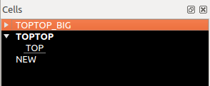
In the hierarchy browser, cell nodes can be expanded showing the child nodes. The "current cell" is the one shown in the center panel. It is drawn in bold font. One or multiple cells can be selected. The selected cells are the ones, the various functions act on. The "context cell" is the cell which is the "active cell" on which drawing happens. The context usually is the same than the current cell, but by descending into the hierarchy, the child cell of the current cell can be made the context cell. It is shown in underlined font.
In the following example, "TOPTOP_BIG" is selected, "TOPTOP" is the current cell and "TOP" is the context cell:
The sub-panel below the hierarchy browser is the library view. This view shows the libraries registered in the system and their content:
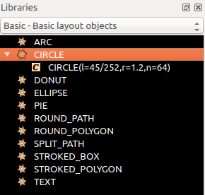
The library view is used to browse and place library cells, which can be normal cells or PCells. Read more about the library view here: The Library View.
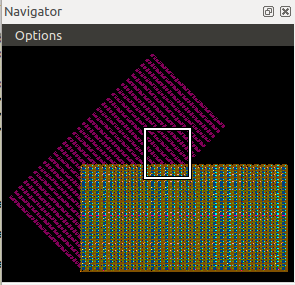
The navigator is invisible by default but can be activated by checking the "Navigator" menu item in the "View" menu. The navigator shows an overview image of the whole cell and a box indicating the clip shown in the center panel:
Center Part - The Canvas
The center panel is the actual canvas. There, the layout is drawn. To zoom in, click with the right mouse button and drag a rectangle that will become the new area shown. Select items by left-clicking or dragging a selection rectangle with the left mouse button pressed. A variety of edit and display modification feature is supplied, for example the ability to add rulers or background images.
Right Part - The Layer List and Layer Style Controls
The right panel is shows the layer list or layer tree. By default, it shows a plain layer list, but the are manifold ways to configure the list, i.e. grouping, styling, adding tabs to easily switch between different setups etc.
The layer tree specifies what and how layout is drawn. Entries can be deleted or configured freely - this does not affect the layout itself. Essentially, the layer list can be entirely independent from the layout and omit layers from the layout or add (empty) layers that are not actually part of the layout. In this scenario, a layer list typically reflects a set of drawing layers with a certain technology-dependent meaning. This list provides a styled layer view for an otherwise undecorated layout file. The layers can be reordered, so their drawing priority is changed. The top layer will be drawn first, while others will be drawn later. Hence the first layer is likely to become obscured by following layers.
Modification operators can be attached to layers - for example, the drawn layout can be transformed geometrical (i.e. translated, rotated, scaled, mirrored) and layout can be selectively drawn when certain conditions for user properties apply.
Below the layer list, a set of control panels is located. The control panels are minimized per default. They can be expanded by clicking on the header bar. These controls form the "Layer Toolbox" where you can modify the layer styles. The styles selected in the layer toolbox will affect the layers selected in the layer list.
Multiple layouts can be shown together. Either they can be overlayed or they can be shown in separate views. In this case, a tab panel appears at top of the main window. Selecting a tab switches between the layouts. Layers for different layouts appear as annotated layers in the layer list - for example "1/0@1" for layer 1, datatype 0, first layout and "1/0@2" for layer 1, datatype 0 and second layout.